
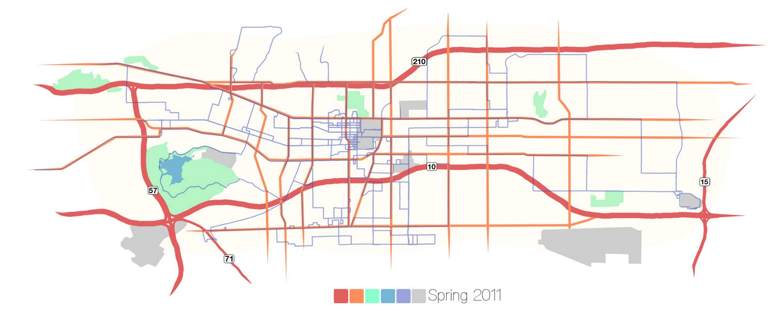
I decided to give maps a second shot. I'd been keeping track of where I went on my bike last semester and that seemed like a decent candidate. Aside from some alignment issues (why does the earth have to be curved, not flat?), I think it came out alright. The dark blue are the cycling routes. I hit 529 miles, but it all looks so insignificant now. I'm conflicted as to how much to label. I did the freeways, but now some of the main roads look naked. I might just have to go back to unlabeled everything.
http://rumsey.geogarage.com/maps/g3451000.html
ReplyDelete